
The Importance of Considering Colour in Branding
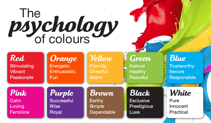
Colour in branding gives unique meaning. There is psychology behind the use of colour in design. When a graphic designer works on a client’s branding, careful consideration is given to the colours that are employed.
Colour & Meaning
Colour is quite emotional. As humans, we have a strong reaction to colour on both a conscious and subconscious level.
When colour and shape are put together it changes the meaning of the colour.


Like images and font choices, colour is equally important in aiding a designer’s ability to communication a message or a company’s brand.
Different colours have different meanings. Designers use colour theory and colour psychology to apply the appropriate colour to a businesses branding.
Some colours work together – complementary – creating a harmonious feel. While others contrast creating a feeling of controversy or dynamism. Designers will often experiment with hues, tints, and shades to refine their colour choices.
Graphic designers work with clients to learn about their company’s ethos and values, so as they have a clear understanding of what their branding needs are, and what colours best reflect this.
The colours used must reflect the words ascribed by the businesses when describing themselves.
Colour Evolution
Graphic designers are aware of people’s primitive responses and complex associations based on learned assumptions. This knowledge is important when designing logos. The use of colour can bring multiple layers of meaning.
Bright colours are loud and attention grabbing. They are seen as bold and cheeky.
Lighter colours are considered muted and they considered professional and authoritative.
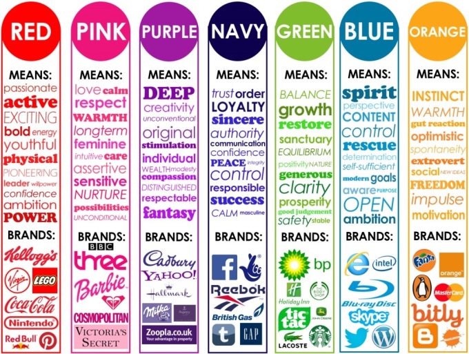
Colour & Branding
We associate some brands with their colours. We all know the red of Coca-Cola and Kellogg’s and the orange of Fanta or the blue of Facebook. Colour is powerful. It should be chosen with all the facts considered and comparisons with other similar brands out there BEFORE any design starts.
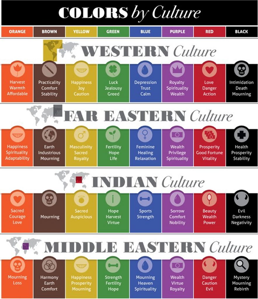
Colour and Culture
Designers use colour differently all over the world. In addition to a colour having a specific meaning, colour also has different meanings among the different cultures around the world. Graphic designers are aware of these culture colour differences. They contemplate the effect their colour choices in order to create a timeless logo and other brand elements. This is especially important for corporate and international branding.
More Colour Theory
Once the designer has considered the colour psychology, shape and culture, he / she looks to refine their colour/s choice. Designers usually choose more than one colour or variations of the same colour. Colours can be analogue, monochrome, and triad, contrasting or complementary. Designers examine which effect will strengthen the brand message.
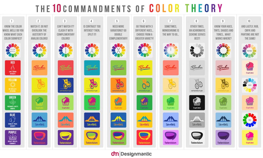
See the chart below to visualise how many variations there.
Conclusion
Choosing the best brand colours is not a matter of picking the colours you think are nice or the ones you like. There are a lot more aspects to consider. Consider at the very least, to consult a professional designer to provide advice and guidance. It pays to get your colours right. Your branding will reflect your business. It will look professional and have an overall stronger presence from a marketing point of view.