Menu Design – The Psychology Behind Good Menus
Menu design has a lot of hidden psychology. There is psychology regarding where items are placed and how dishes are described. This is key to getting the most from a menu. We often don’t think about how much graphic design influences our lives. Design isn’t simply making something look great. A lot of work goes into research and psychology behind a piece of design. Getting something designed professionally makes a difference and influences how customers choose.
Important factors for designing a menu
- The type of restaurant or café
- The type of food and choice of dishes
- Menu sections
- Dish descriptions
- The colours and font used
- The layout
- Images used
- Pricing
- Glossary
- Storytelling
The Type of Restaurant / Café
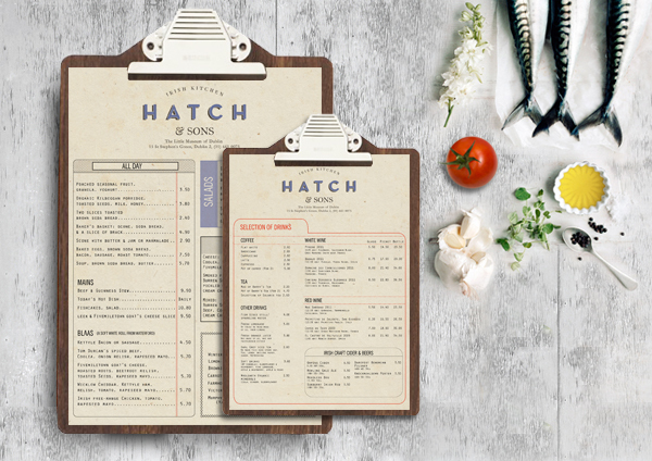
Your menu design should reflect the type of restaurant / café you run. Graphic designs will research similar restaurants / café and work to reflect your business in your menu. It doesn’t look good if your menu has a modern, minimal design but your clientele are local country folk. Your menu needs to appeal to your target customers.
The Type of Food and Choice of Dishes
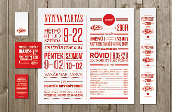
The type of food you serve has to be reflected in your design using colour, descriptions, and font choices. Also, the choice of dishes on your menu needs to be laid out professionally so they are easy to read and sound appealing.
Menu Sections
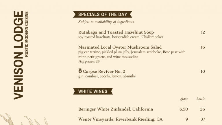
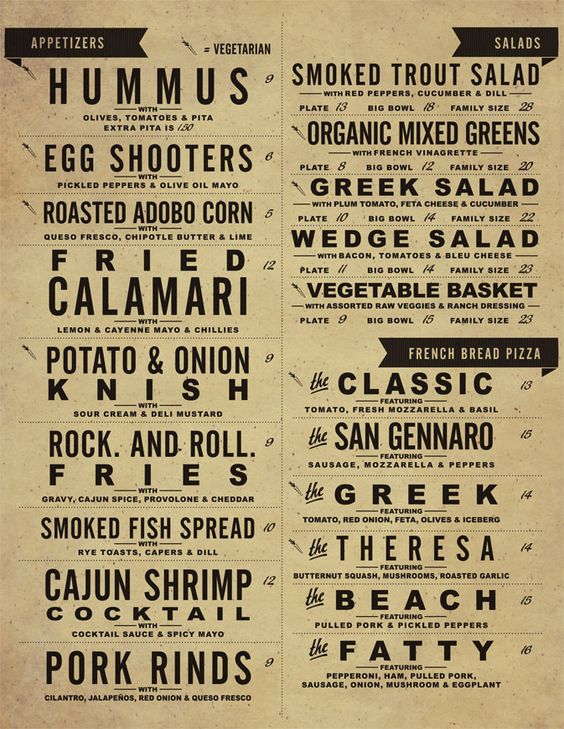
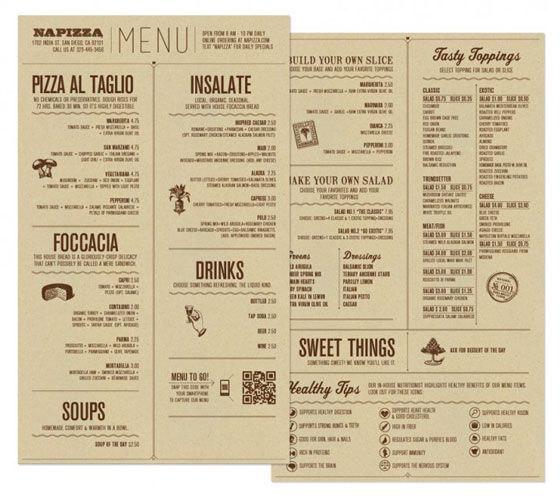
Menu sections are very important. They help customers clearly see what you serve. They also help the customer to navigate the menu. It should flow nicely. Did you know that the right hand corner of a menu is a sweet spot? Customers tend to order from here the most. It might be a good idea to place your most expensive dish here.
Dish Descriptions
These are essential on a menu. It is proven customers enjoy well-described dishes that include ingredients and flavours. Customers want to know how the dish will taste. A dish description creates an image in a customers mind. Using words like ‘succulent, wholesome, farm fresh, homemade’ conjure up positive images in customers minds. It is important to spend time thinking about HOW you are describing your food.
Colours & Fonts
We are very visual creatures and colour has unconscious associations. We are not always aware of these but designers are. They use colour to portray meaning and reinforce their communication of messages. Certain colours encourage customers to feel hungry like red whereas green feels healthy and orange translates to wholesome.
Layout
Cluttered layouts give the impression of carelessness. Customers can easily think the preparation of the food will be the same. Again, a planned layout with attention to detail creates a strong positive impression. A restaurant / café environment is busy. A menu needs to be clear and easy to read.
Imagery
Some menus use images. Depending how this is done, it can be a good thing or a bad thing. Images of food require great photography. Often there isn’t space on a menu to show an image of everything. Also, a restaurant may employ more than one chef and the dish may look different every time. Customers want to get what they can see. I think using images is more suited to other forms of marketing like flyers / posters.
Pricing
When customers think of restaurants / cafés they think in terms of the quality of food but also in price. Some menus place the most expensive dishes on top giving the impression of quality alluding to the idea that you are getting a bargain with the dishes below. Another design idea is not to include the currency symbol. It takes the emphasis off price. Some restaurants even write the price using the word; this leads customers to spending up to 30% more.
Glossary / Advice
This feature has become more popular in the last couple of years. Allergies, nutritional information, and type of diner (vegan, vegetarian etc.) advice have featured more and more on menus. Customers like to be more aware of food content before making a choice. A menu that offers more information is a winner.
Storytelling
This allows a restaurant / café to tell the customer a little of its history. Customers don’t just see a menu as a list of food; they read it like an advertisement. If you have a good story, why not tell it.
Conclusion
Menu design holds a lot of psychology. Graphic designers use these features to design that menu that works for your restaurant / café.
